AIRLINER
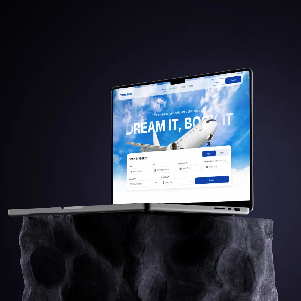
Flights, hotels and itineraries in one responsive booking flow.
BACKGROUND & CONTEXT
Planning a trip means flights on one site, hotels on another and reviews somewhere else — repeated data entry, no real comparison, and mobile experiences squeezed out of desktop layouts.
TARGET USERS
Independent travellers booking flights and accommodation themselves
THE GOAL
Collapse a multi-site booking process into one comparable, mobile-ready flow.
MY PROCESS
- Competitive audit
- flows
- responsive wireframes
- UI
- prototype
KEY DECISIONS
- Side-by-side comparison instead of separate result pages
- Designed mobile-first, then scaled up
- Saved payment details to remove repeat entry
THE SOLUTION
One responsive platform for flight search, hotel booking, itinerary management and verified reviews — with side-by-side comparison, saved payment details, auto-filled confirmations and personalised recommendations.
KEY FEATURES
- Flight & hotel search
- Side-by-side comparison
- Itinerary management
- Verified reviews
- Saved payment details
DESIGN SYSTEM & ACCESSIBILITY
One component set scaling across mobile, tablet and desktop breakpoints. Comparison tables keep row headers pinned and forms use persistent labels rather than placeholder-only fields.
OUTCOME
A responsive system that holds up across three breakpoints without redrawing the interface each time.
BY THE NUMBERS
~180 screens across 3 breakpoints in 2 weeks
What I learned
Designing the smallest breakpoint first made the desktop layout a decision, not a rescue.