FOODTOPIA – FOOD ORDERING APP
Lab project
A restaurant's own ordering app: order, pay, track and reorder without a third-party platform.
View prototype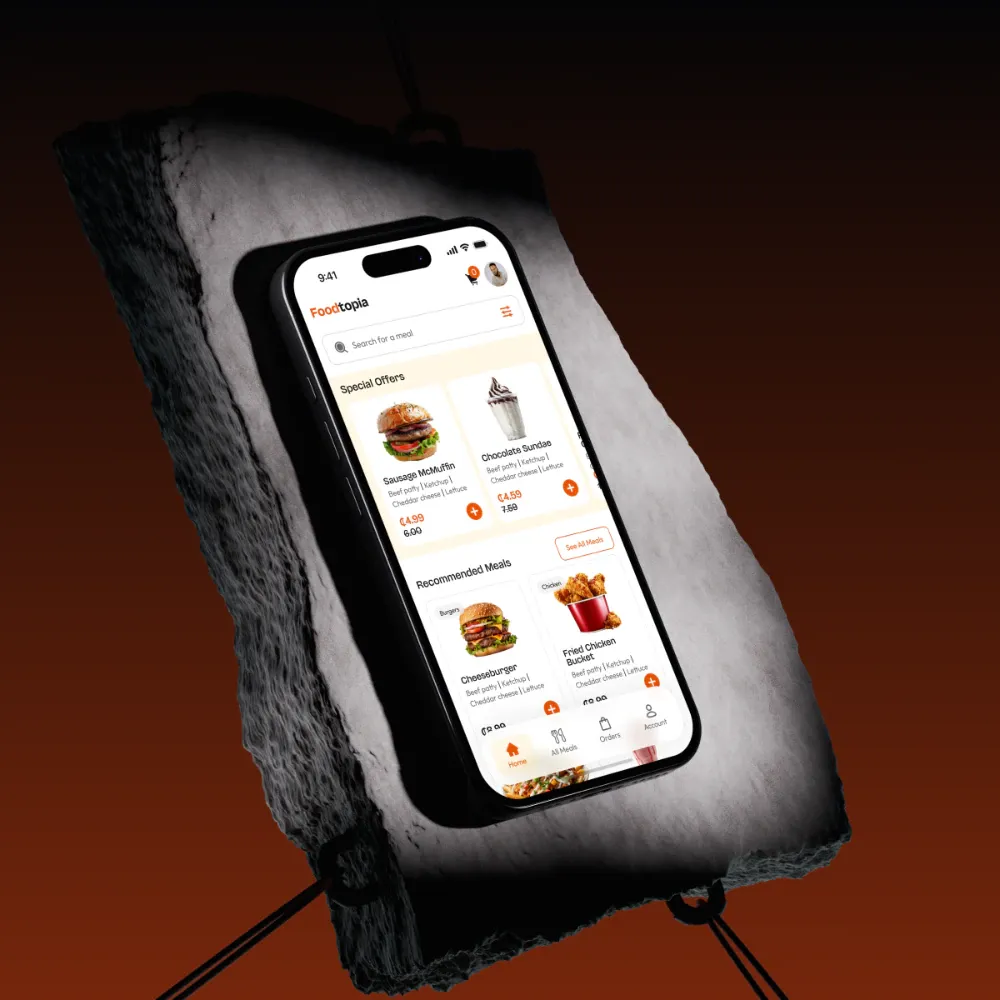
BACKGROUND & CONTEXT
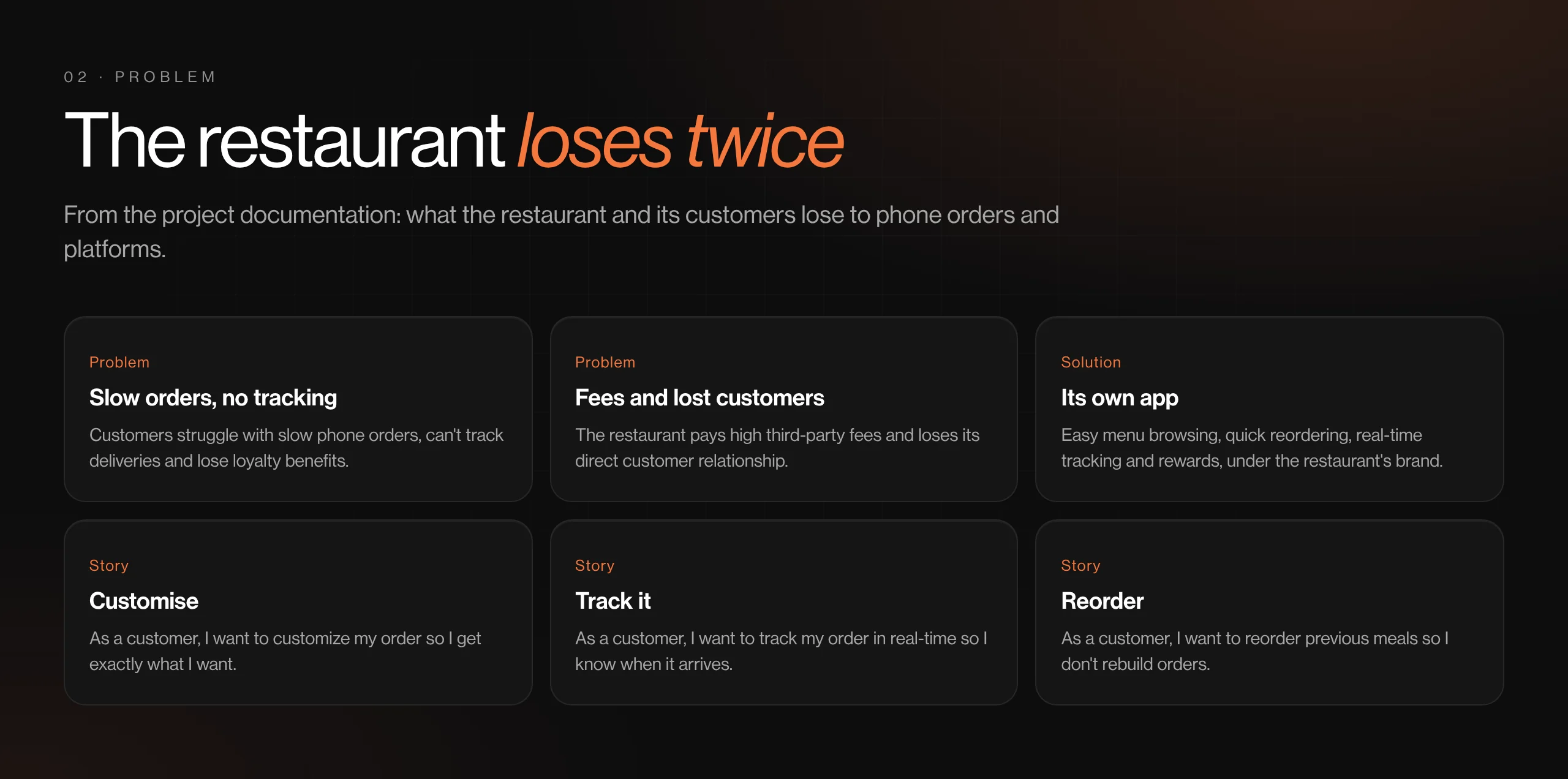
- Customers struggle with slow phone orders, can't track deliveries and lose loyalty benefits.
- The restaurant pays high fees to third-party platforms and loses the direct relationship with its customers.
- The lab brief: design the restaurant's own branded app, from user stories to a working prototype.
TARGET USERS
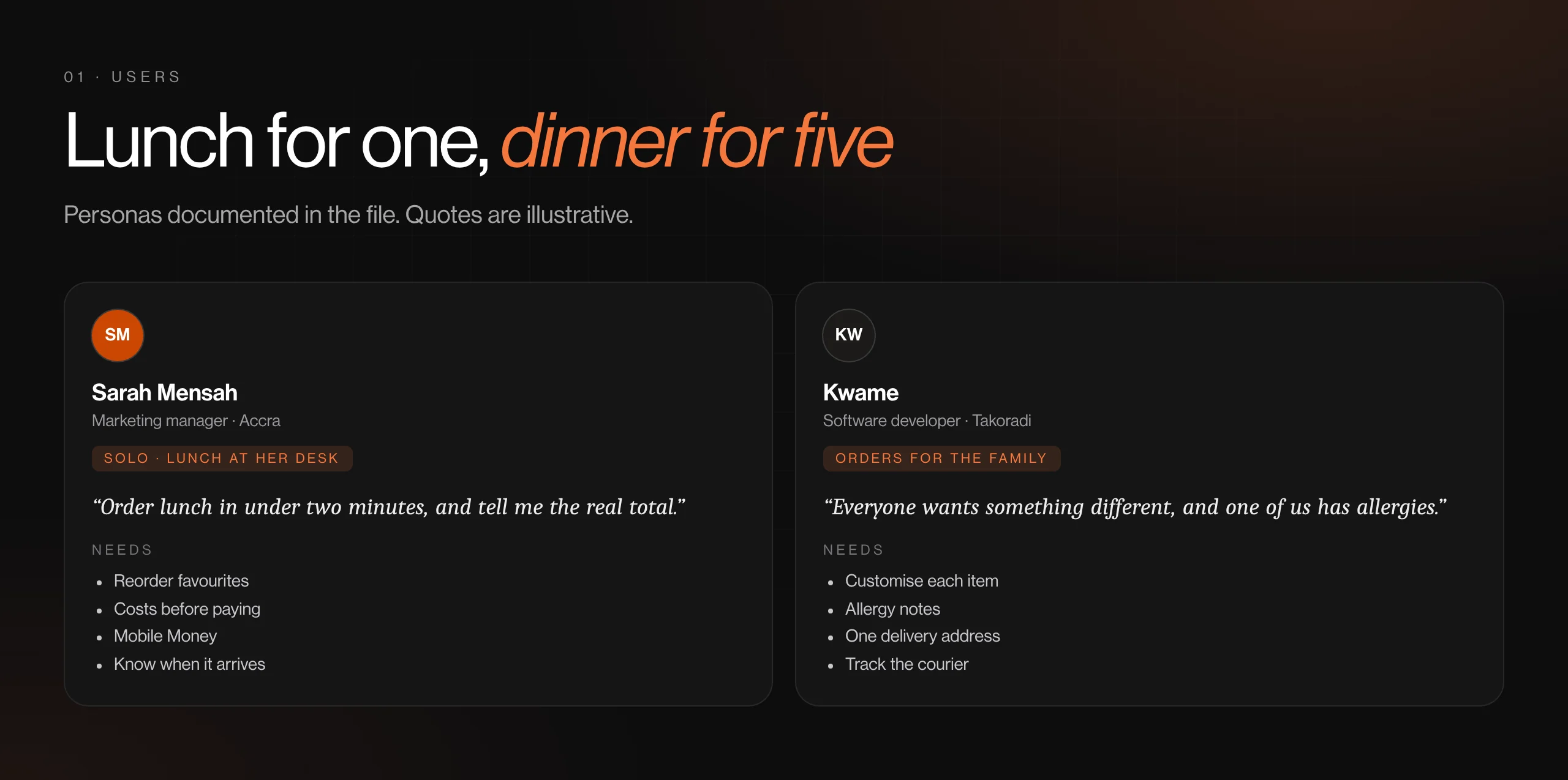
Solo diners like Sarah (marketing manager, Accra): ordering lunch at her desk, deciding on speed and total cost
Family orderers like Kwame (software developer, Takoradi): ordering for several people, deciding on add-ons, allergies and delivery time
THE GOAL
Give one restaurant a direct channel it owns: quick to order from, clear about cost, and easy to come back to.
MY PROCESS
- Problem statement
- User stories
- Personas & mind maps
- User flow
- UI
- Prototype
KEY DECISIONS
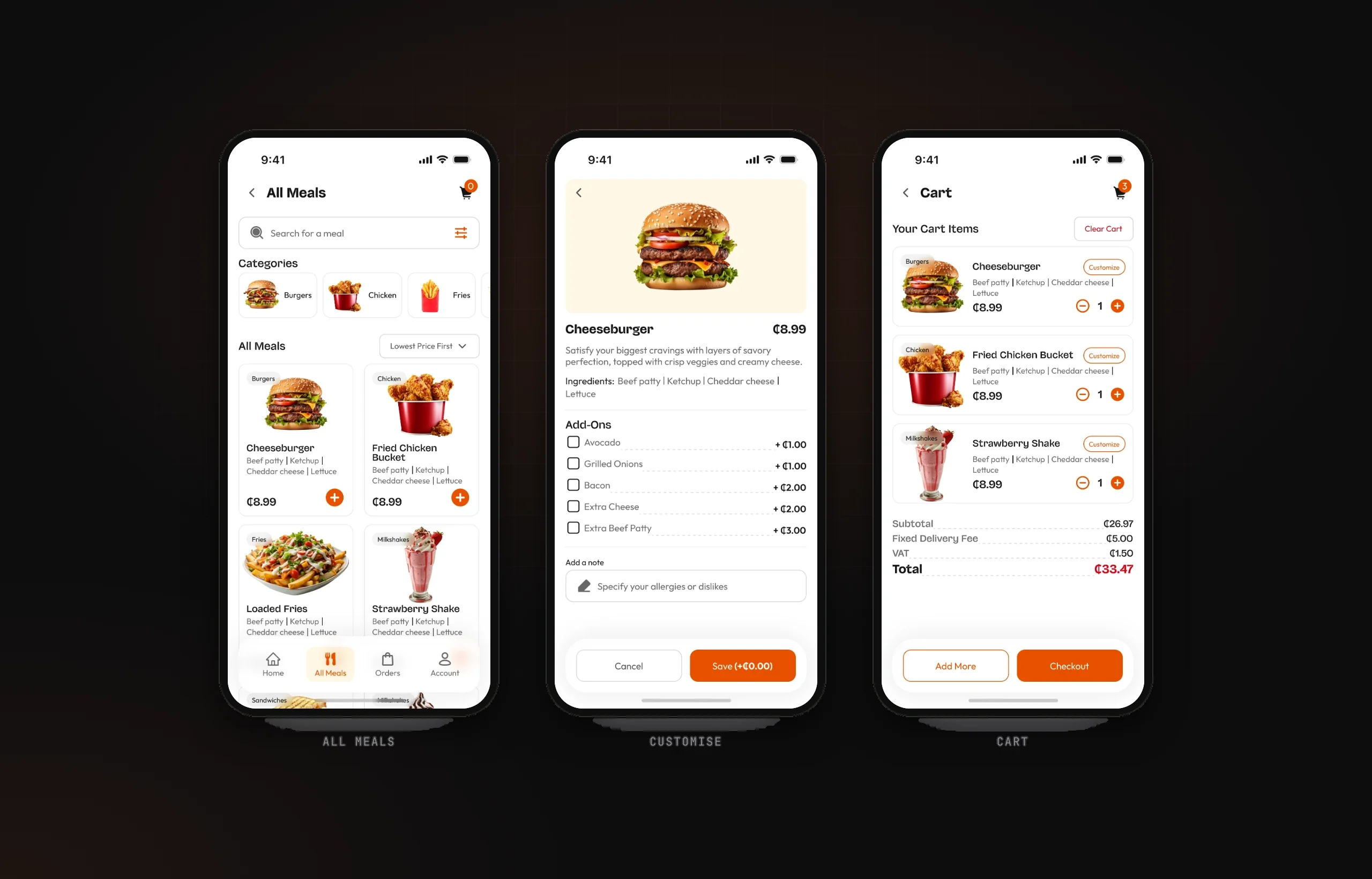
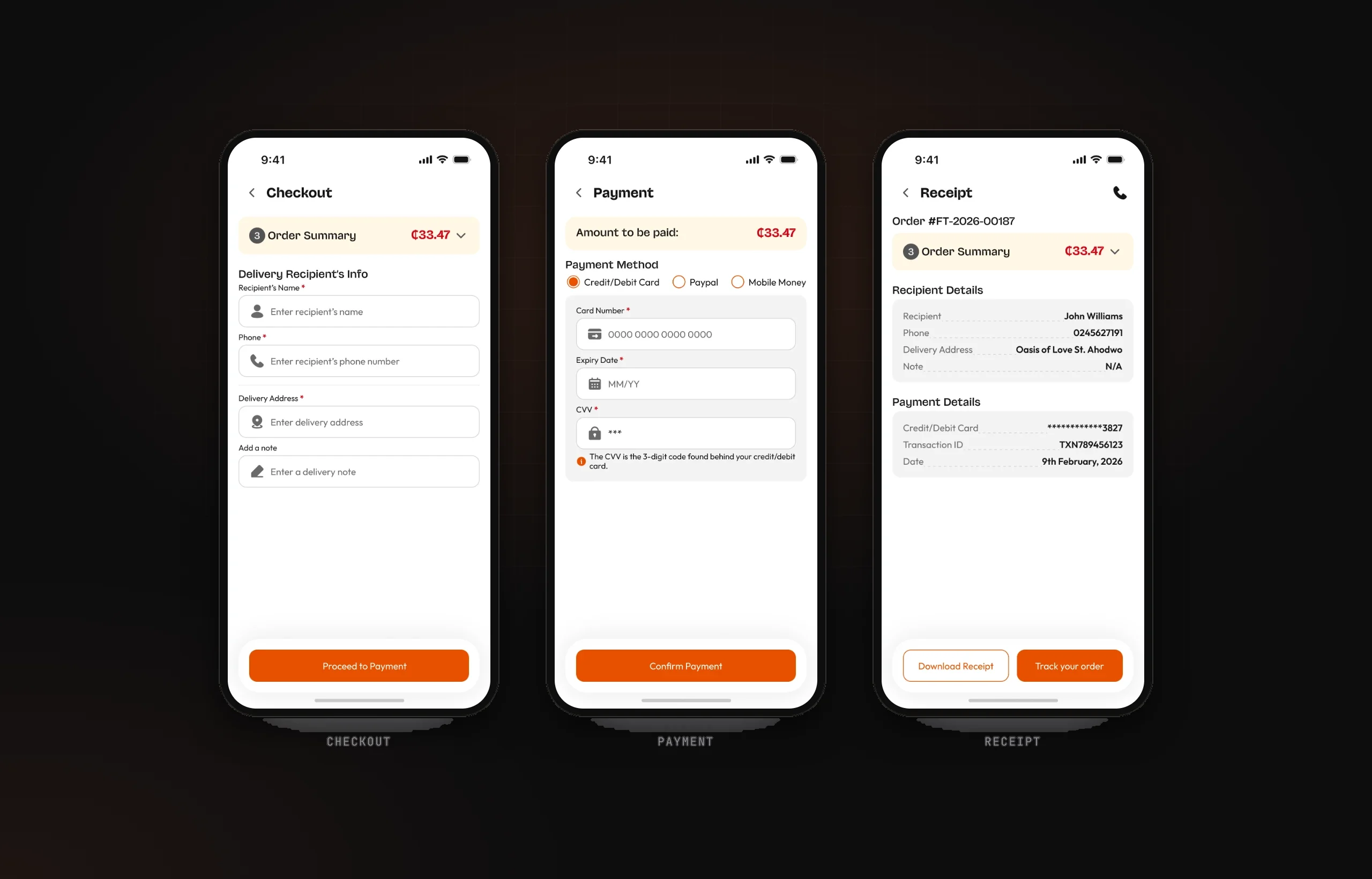
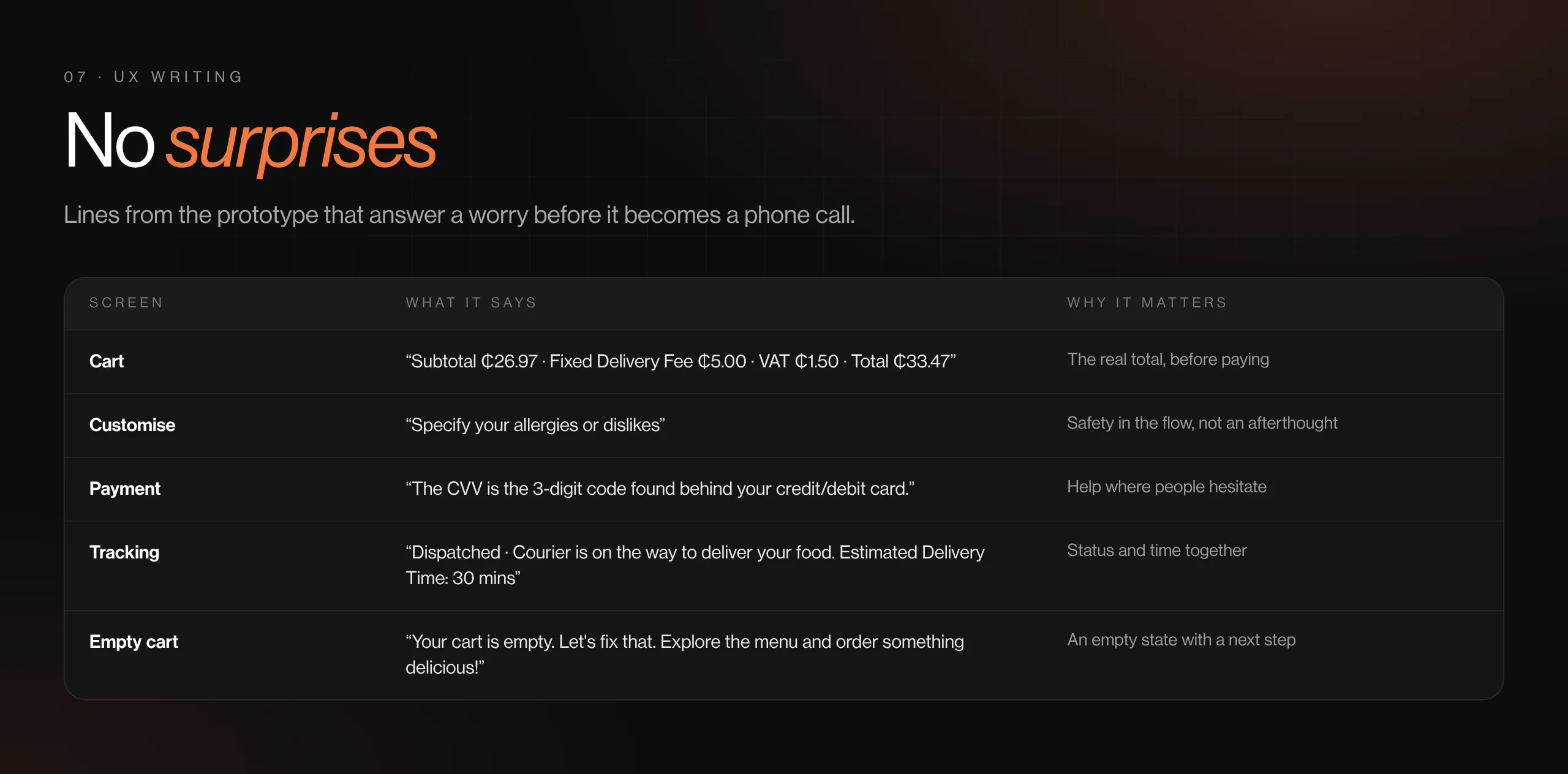
- Every cost shown before payment: subtotal, a fixed delivery fee and VAT
- Add-ons priced inline and a free-text note for allergies or dislikes
- Three ways to pay: card, PayPal or Mobile Money
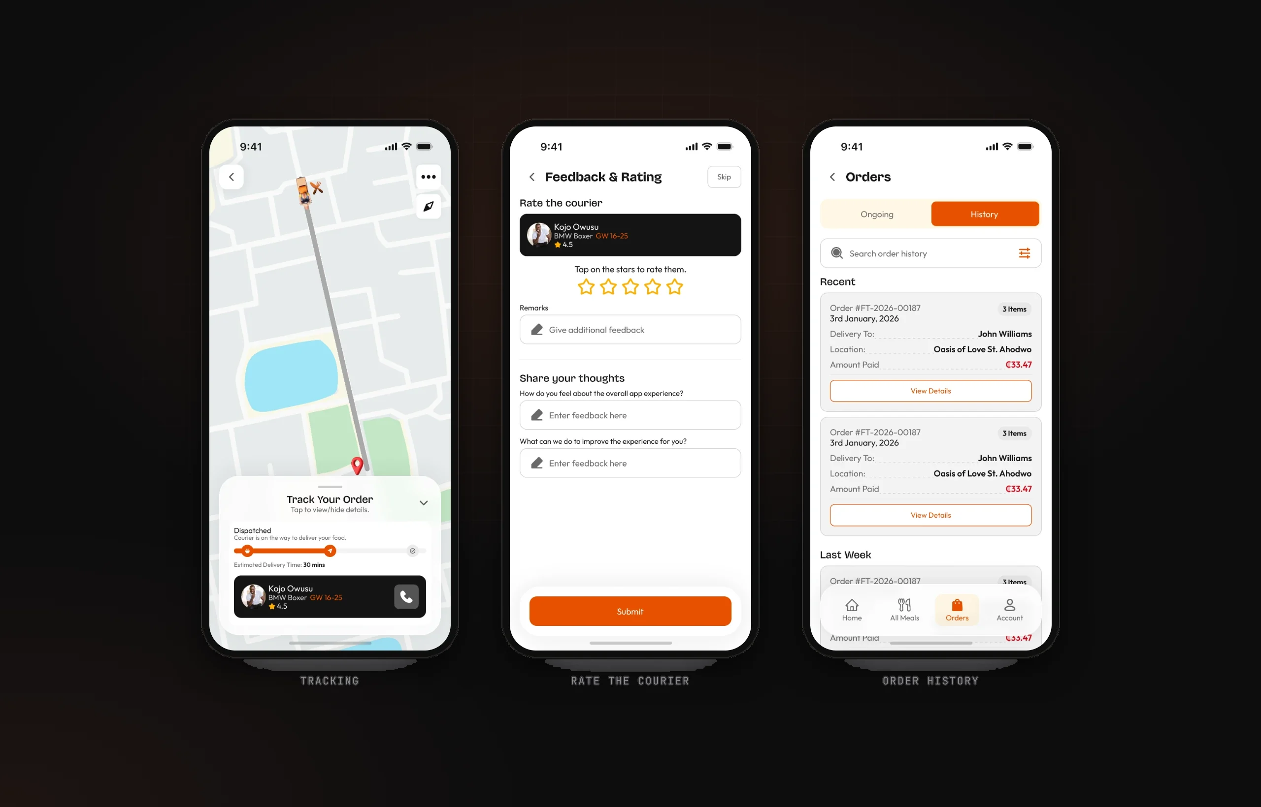
- Tracking as a three-step progress bar over the map, with the courier and a call button
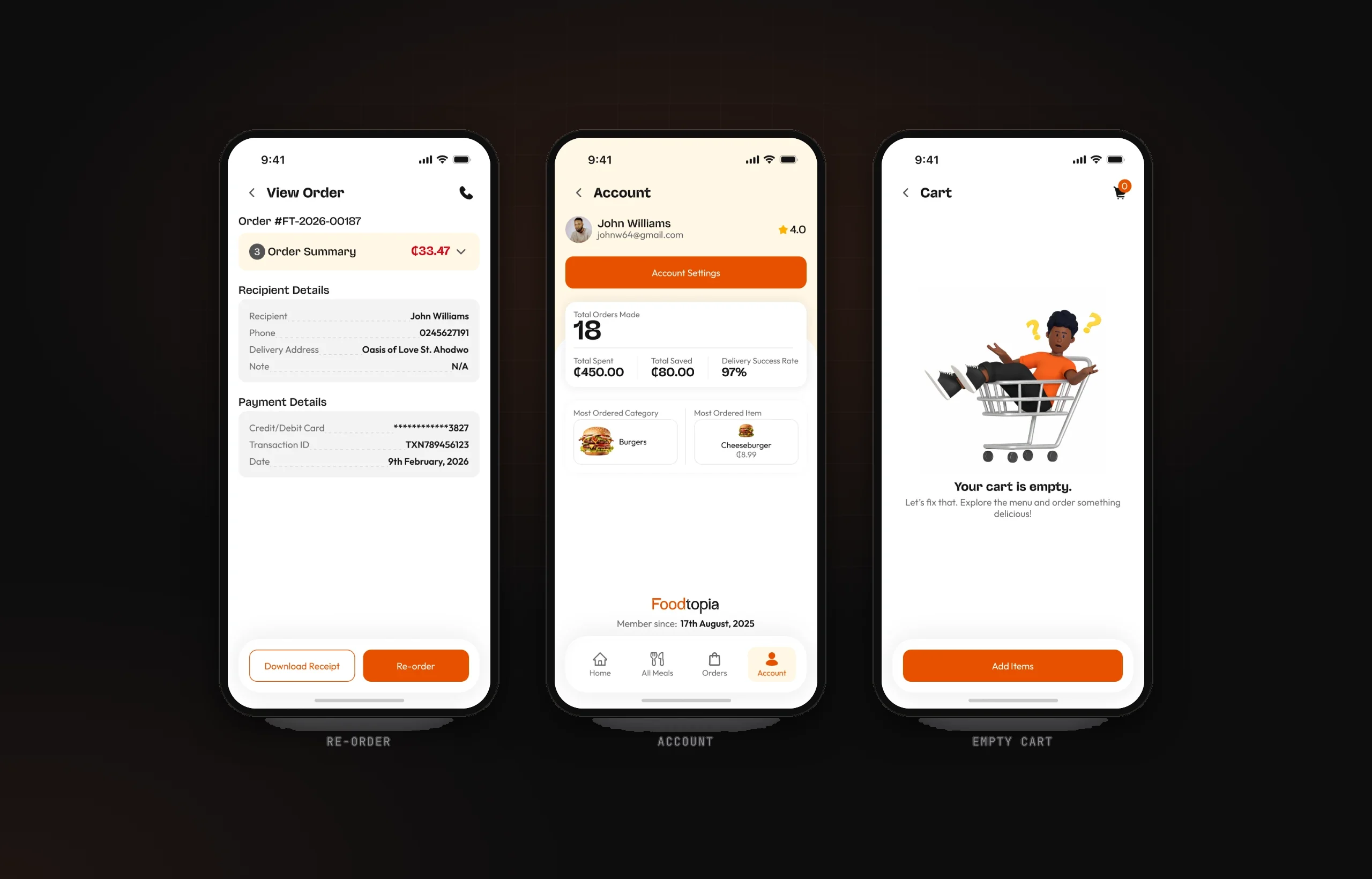
- Reorder from any past order, and an account page that shows what you've saved
THE SOLUTION
- Order: special offers, recommended meals, categories, search and sort by price, then customise with priced add-ons.
- Pay: a cart with a clear cost breakdown, recipient details and card, PayPal or Mobile Money, with success and error states.
- Track: Preparing → Dispatched → Delivered, an estimated delivery time and a rated courier.
- Come back: order history, a receipt you can download, a 'Re-order' button and an account with orders, spend and savings.
KEY FEATURES
- Offers & recommended meals
- Priced add-ons & allergy notes
- Transparent cost breakdown
- Card, PayPal & Mobile Money
- 3-step live tracking
- Order history & reorder
DESIGN SYSTEM & ACCESSIBILITY
- One menu-item card powers offers, recommendations, the full menu and the cart; variables drive quantities and states in the prototype.
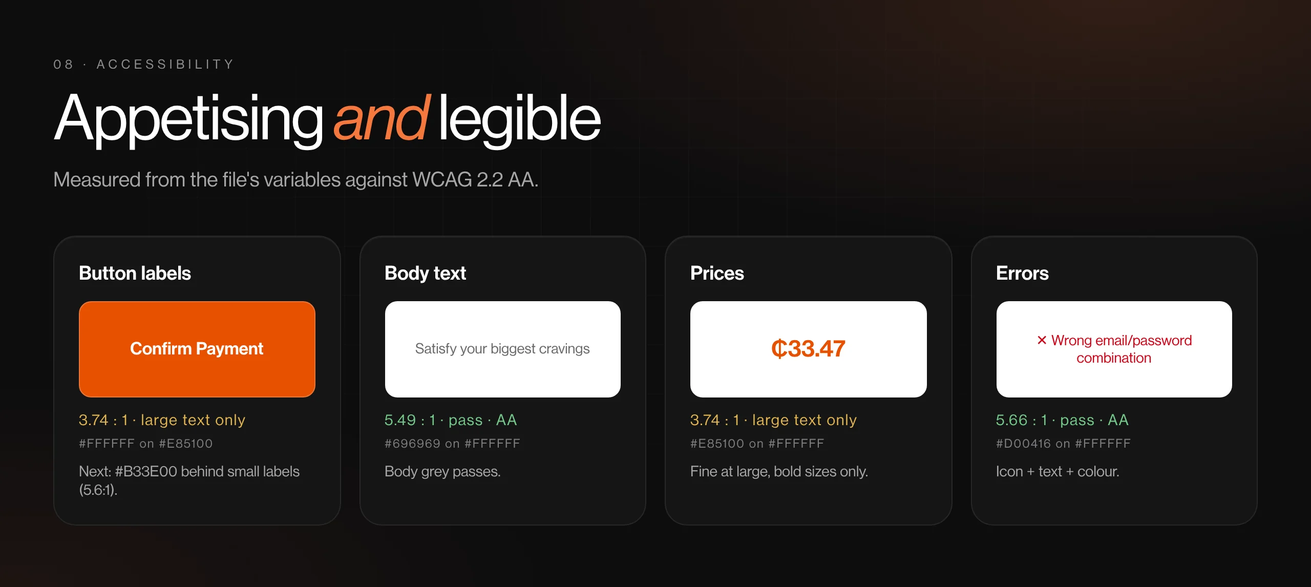
- Errors use an icon and text, and every tracking step has a written status, not just orange fill.
- Next round: white on orange #E85100 is 3.7:1, so button labels need a darker orange (#B33E00) or bold large text; header icons are 40 px, under 44.
View gallery (8 images)Hide gallery
 (opens full size in a new tab)
 (opens full size in a new tab)
 (opens full size in a new tab)
 (opens full size in a new tab)
 (opens full size in a new tab)
 (opens full size in a new tab)
 (opens full size in a new tab)
 (opens full size in a new tab)
BY THE NUMBERS
- Third-party platforms between restaurant and customer
- 0
- To reorder a past meal
- 1 tap
- Ways to pay, Mobile Money included
- 3
OUTCOME
- A concept showing how a single venue can own its ordering channel end to end, from first order to reorder.
- Every login state prototyped, including errors and an authenticator step.
- A clear next step from the brief: loyalty rewards and promo codes in the checkout, which the account page already sets up with 'Total Saved'.
What I learned
The business case shaped this design more than the customer flow did: owning the relationship means making the second order easier than the first.