SOPHADDO – E-COMMERCE
One platform for two very different buyers: agro wholesale, artisan jewelry and the back office that runs both.
Visit website
BACKGROUND & CONTEXT
- Sophaddo sells raw agro goods (shea butter, cocoa butter, cashews and oils) to manufacturers by the kilo, and handcrafted jewelry to individual shoppers.
- Orders arrived by phone, WhatsApp and email, and prices were negotiated by hand.
- Stock lived in spreadsheets, with no single view of shipments coming in by sea or going out to buyers.
TARGET USERS
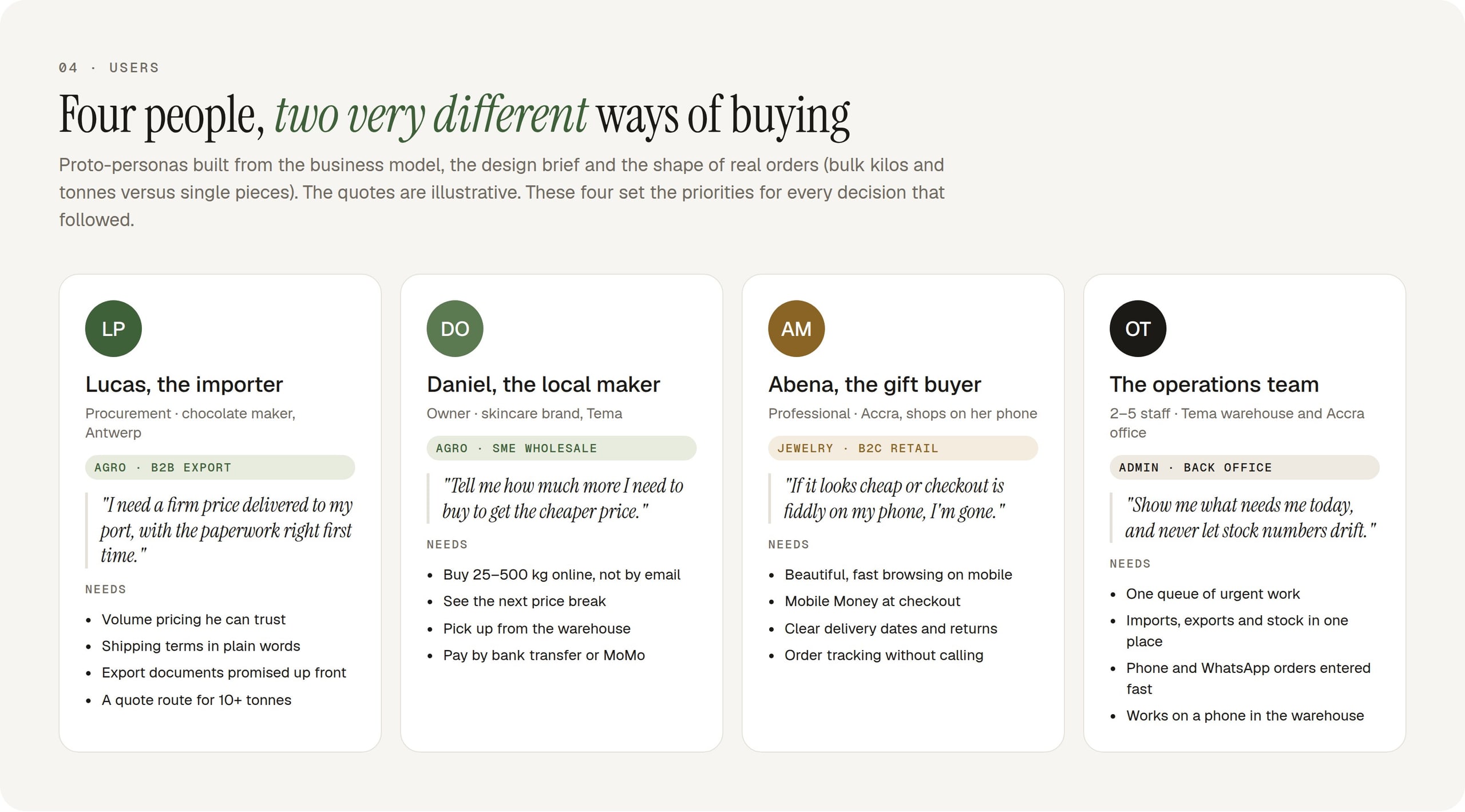
Agro buyers: procurement managers ordering by the tonne, deciding on price per kg, documents and terms
Jewelry buyers: shoppers on their phones, deciding on look, story and delivery date
The operations team: running orders, stock and shipments from a desk or a phone in the warehouse
THE GOAL
Let a procurement manager in Antwerp and a shopper in Accra both buy without help, and give a small team one place to run the business.
MY PROCESS
- Design inventory
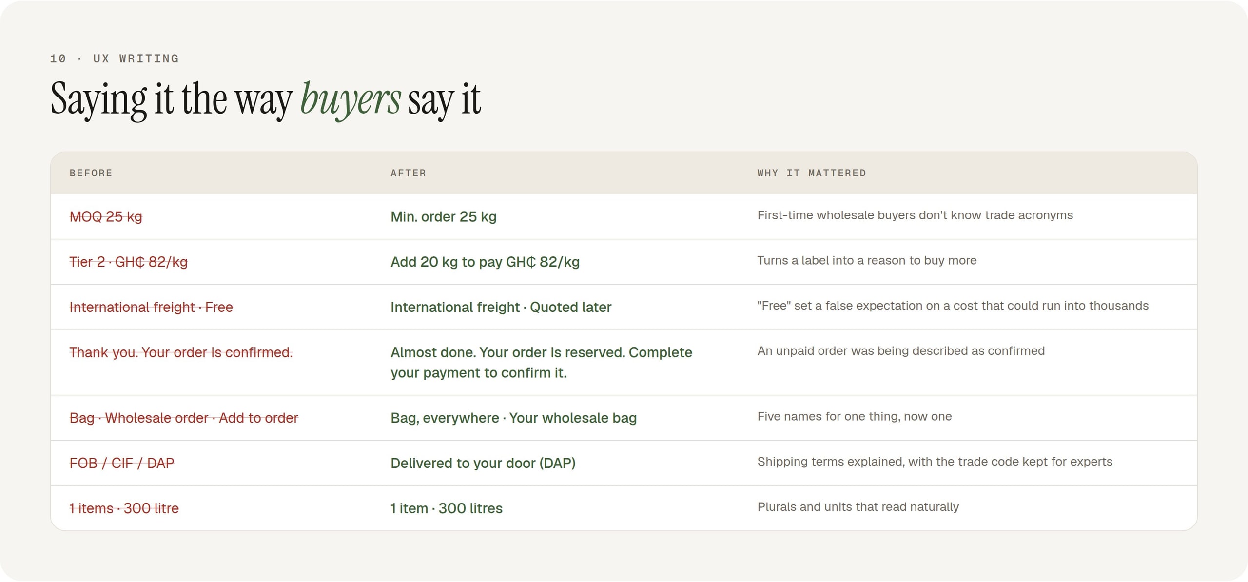
- Heuristic & UX-copy audit
- Accessibility audit
- Flow walkthroughs
- Domain analysis
- IA
- UI & design system
- QA
KEY DECISIONS
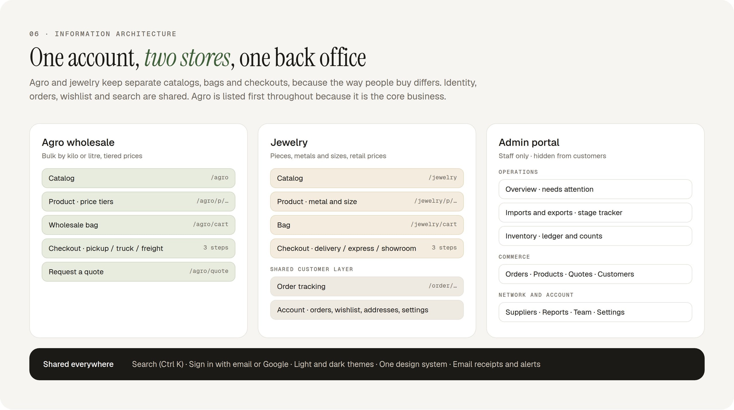
- Two bags and checkouts where buying differs; one account, search and order history where identity matters
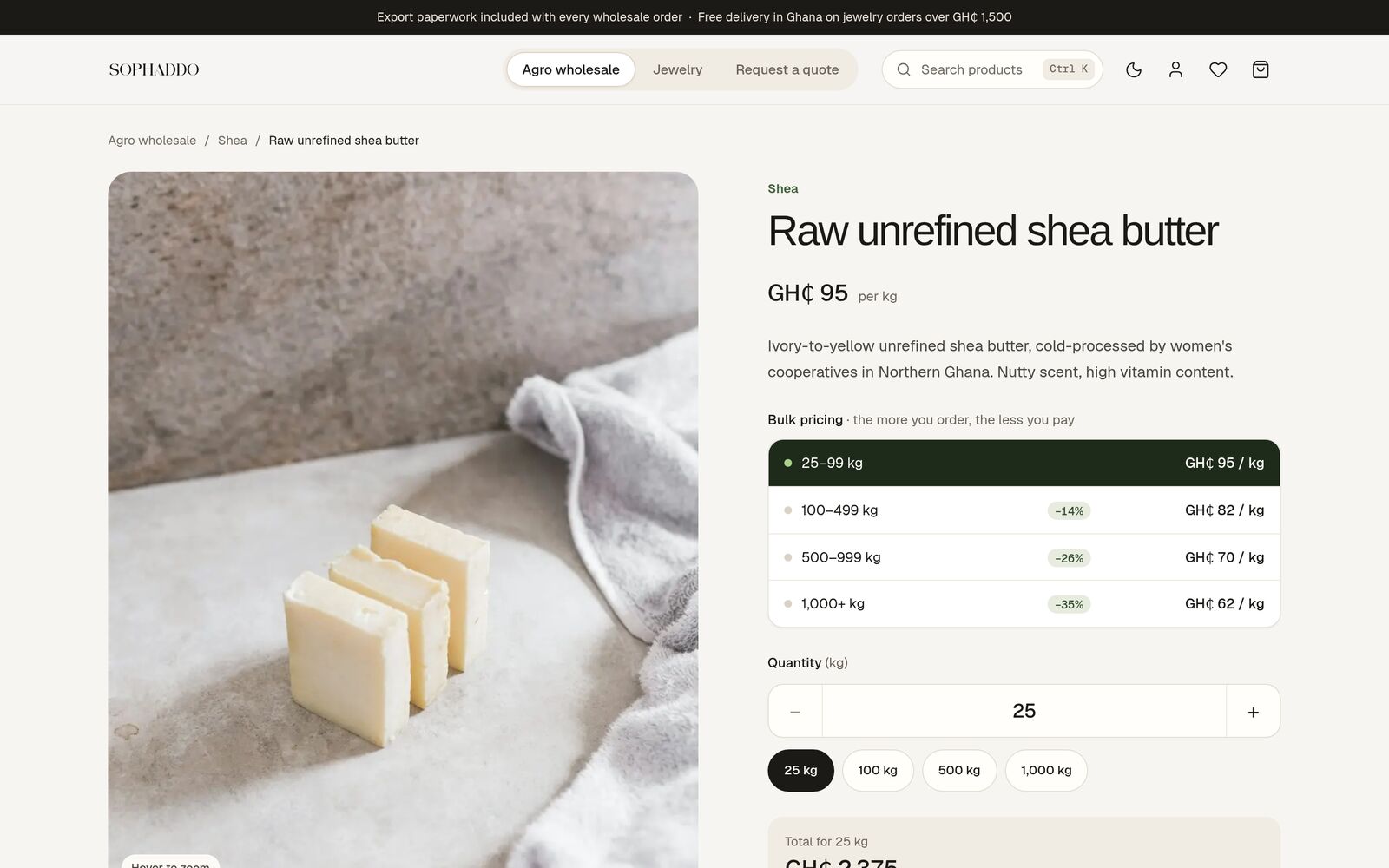
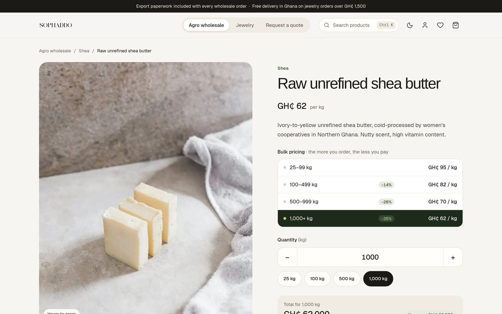
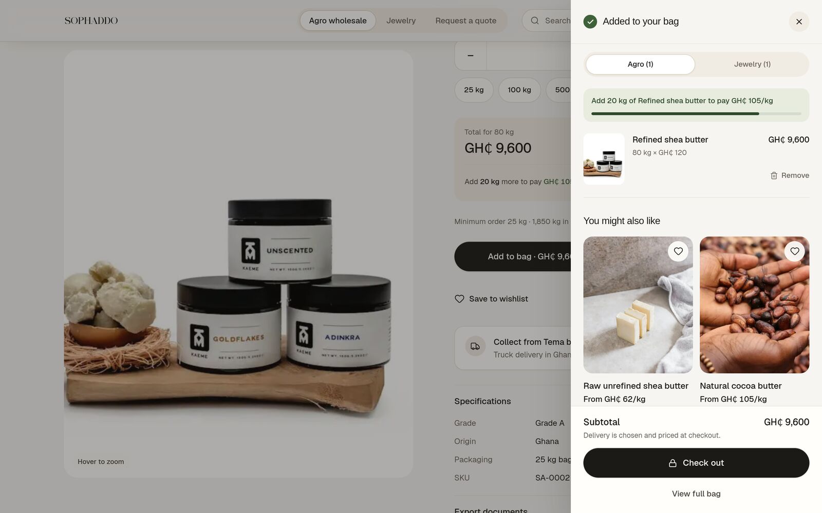
- Price logic made visible: the live tier, the saving and the next price break
- Plain words first, trade terms second: "Delivered to your door (DAP)", not a bare "DAP"
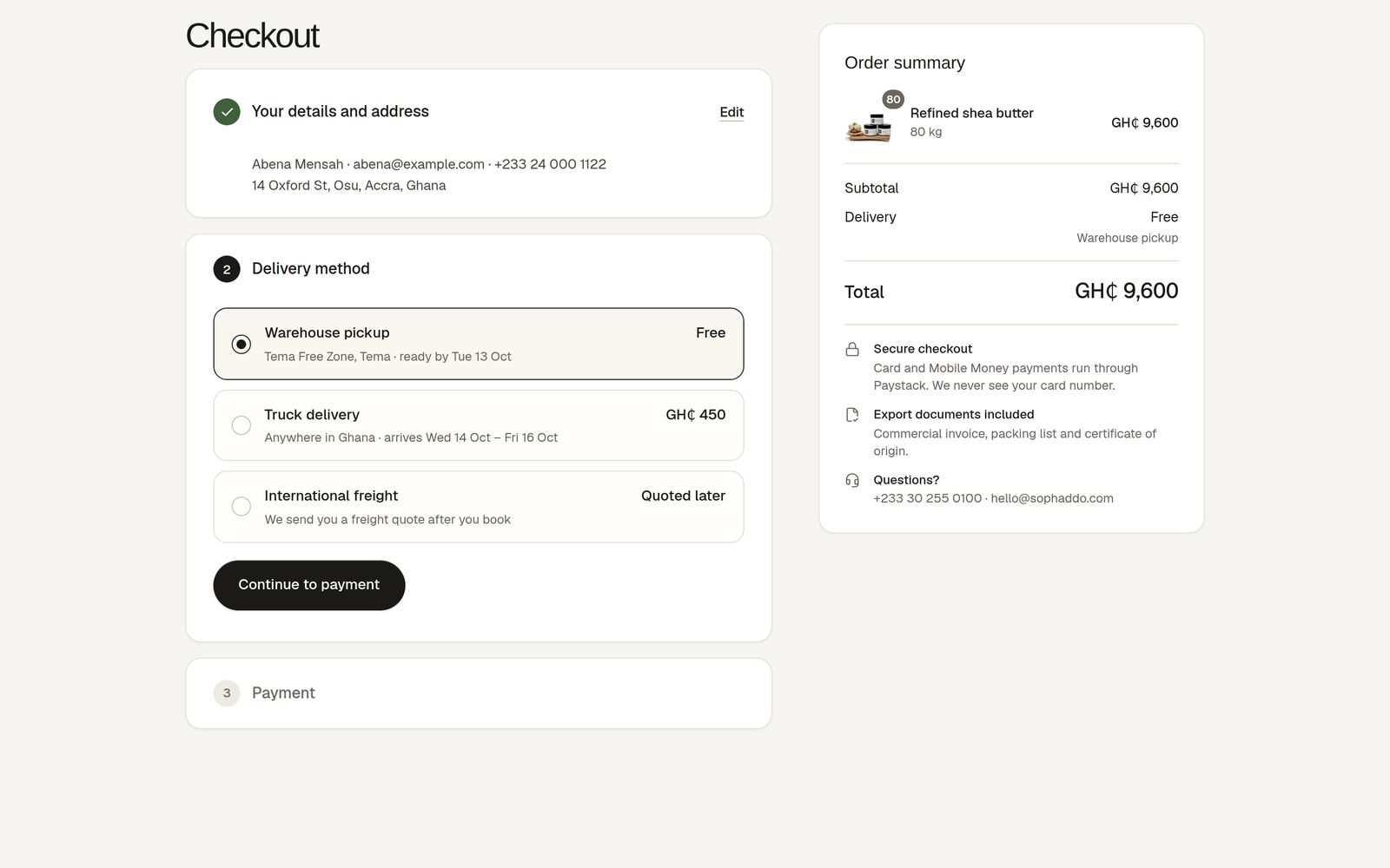
- Never overpromise: international freight reads "Quoted later", not "Free"
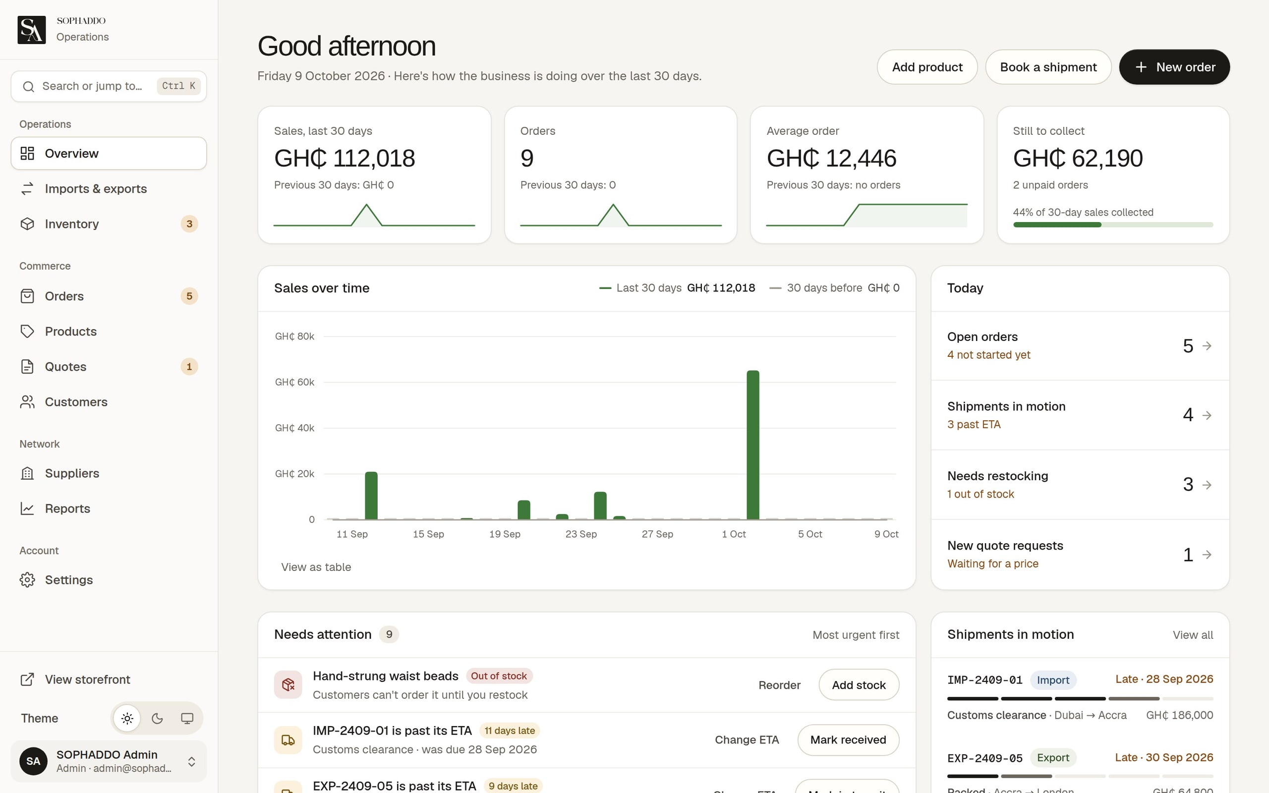
- An admin built around one question: "What needs me right now?"
THE SOLUTION
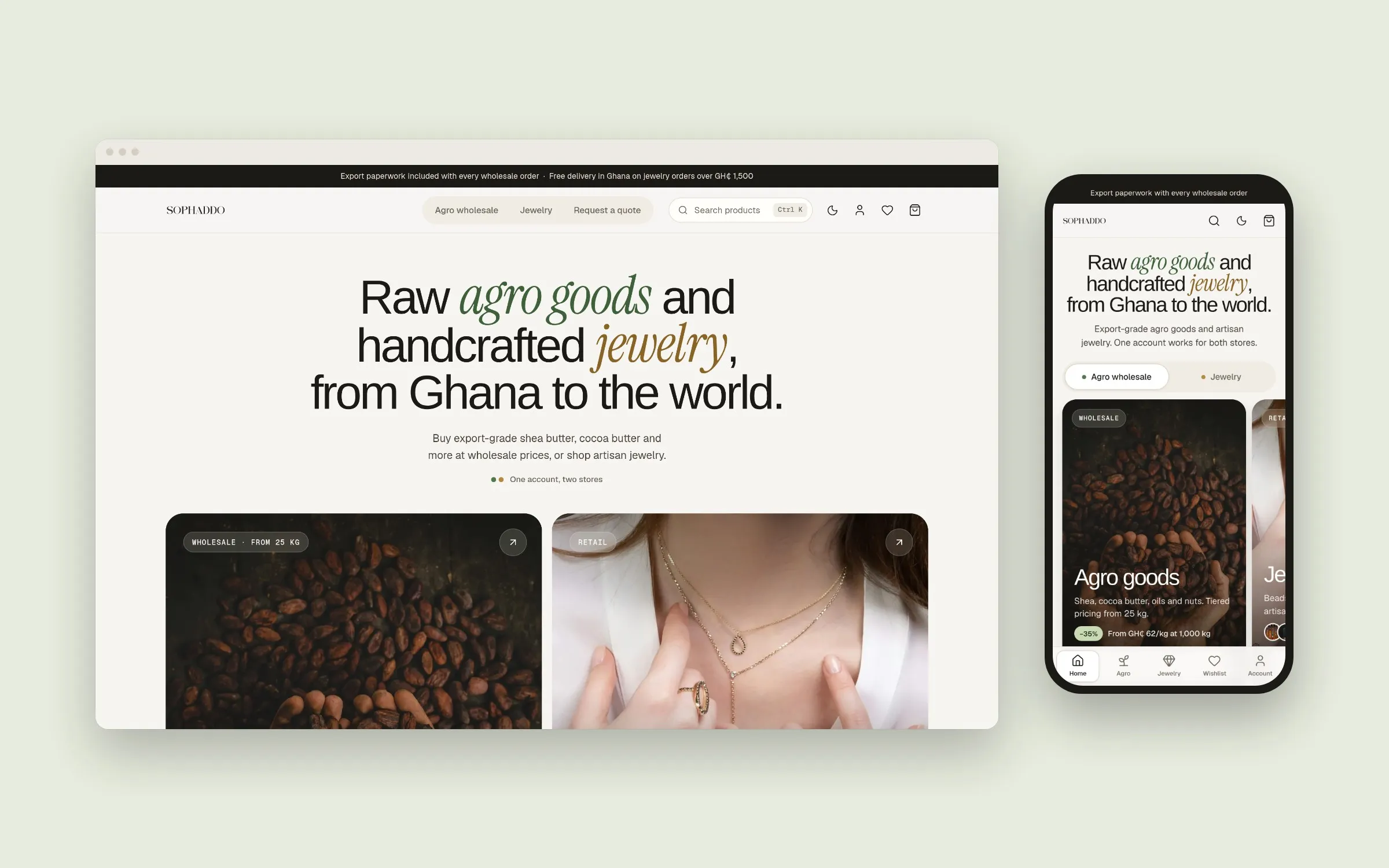
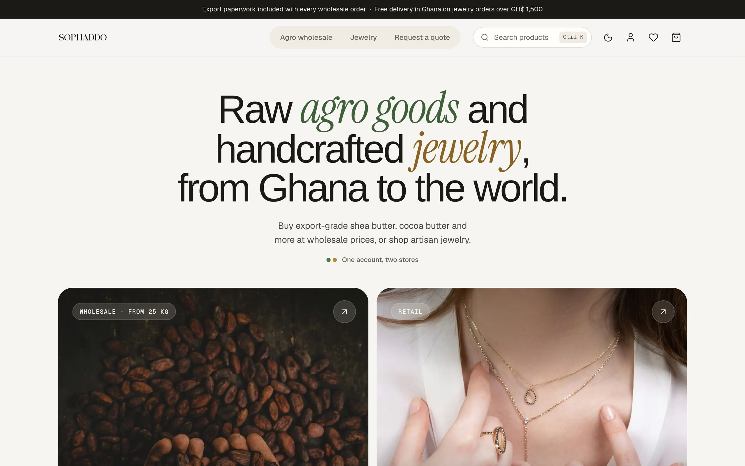
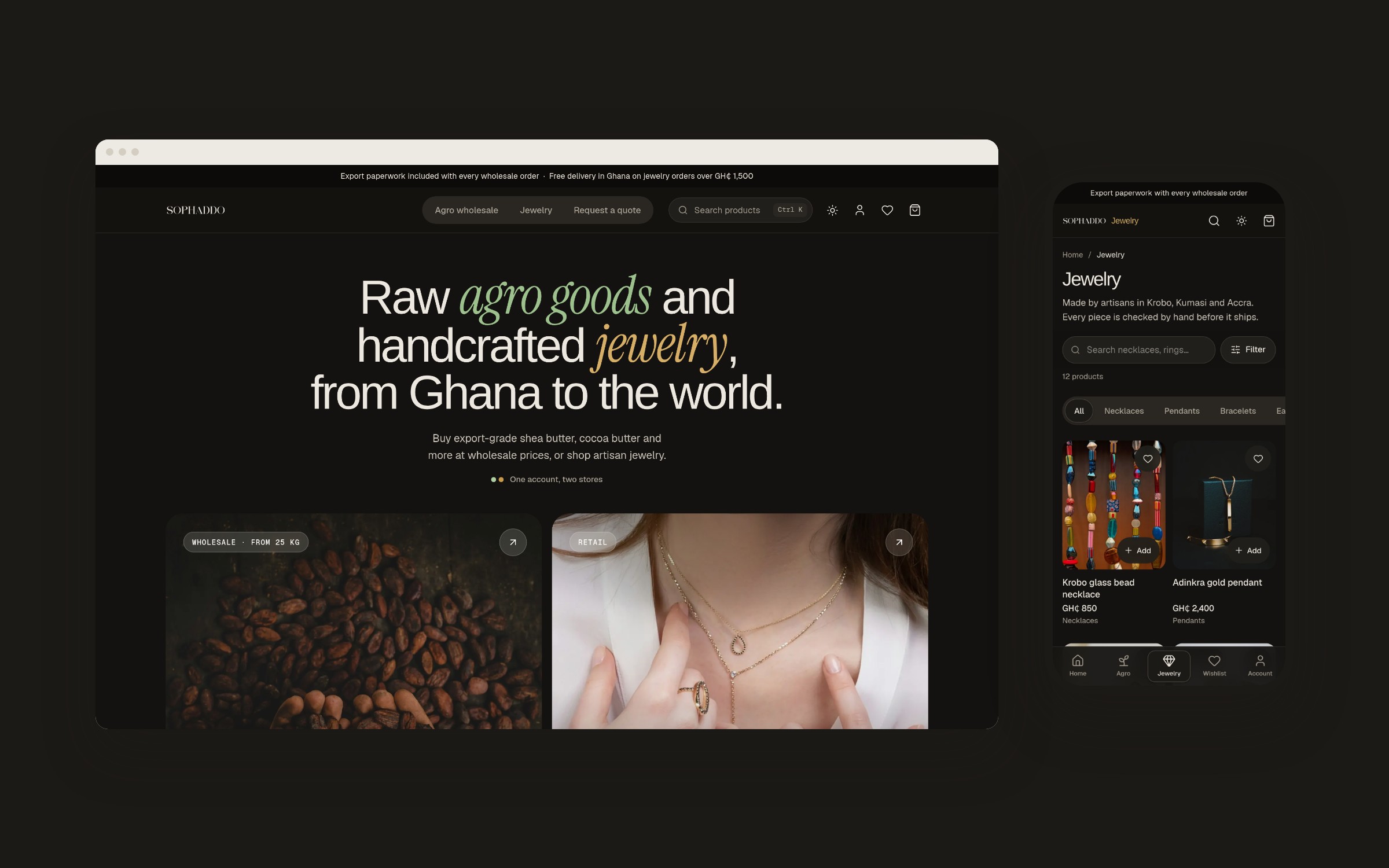
- Storefront: a split home page sends each buyer to the right store within seconds.
- Pricing: agro pages highlight the buyer's price tier as they type, and bags nudge towards the next price break or free delivery.
- Checkout: three steps with Mobile Money first; large orders get a plain-language quote request.
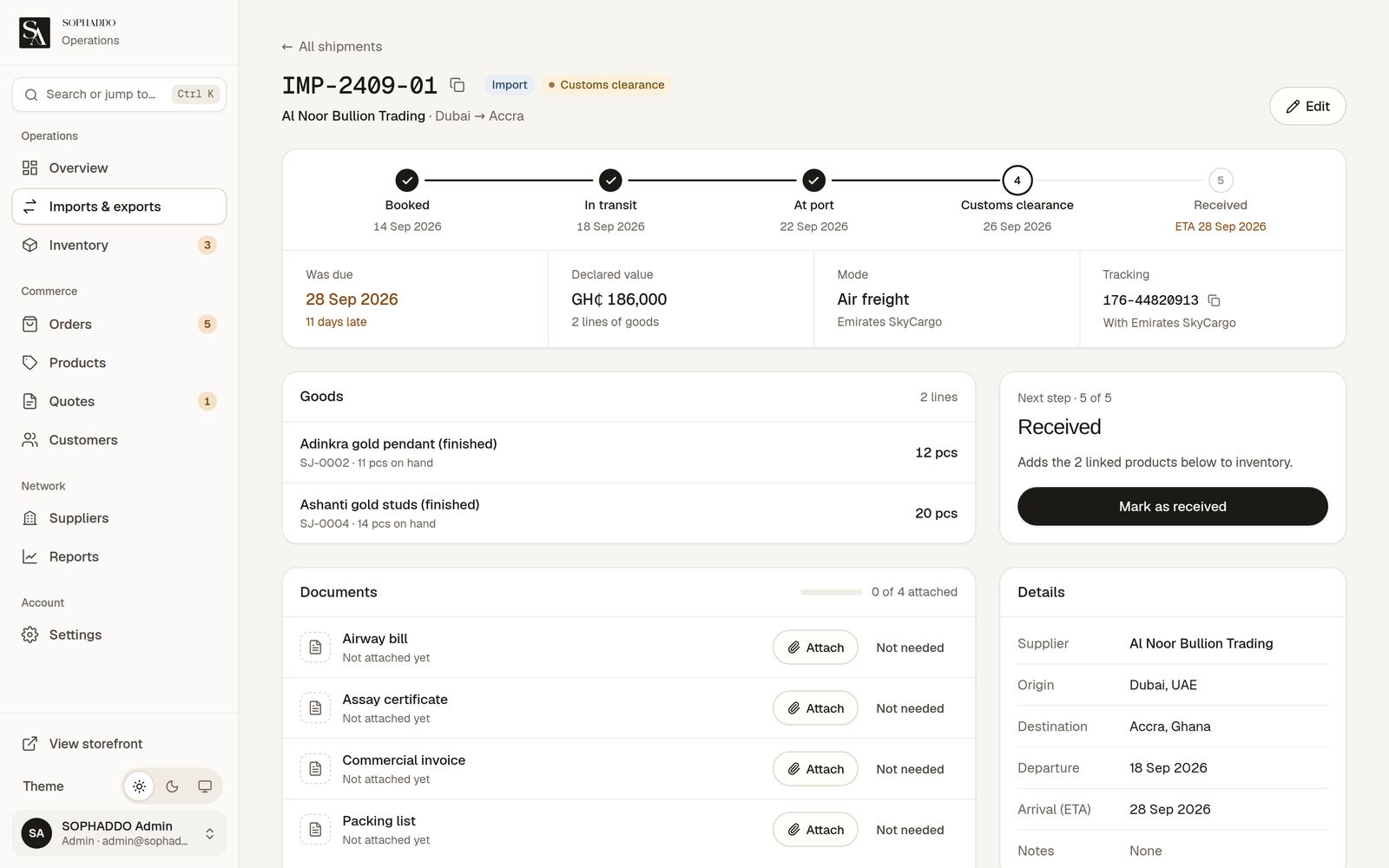
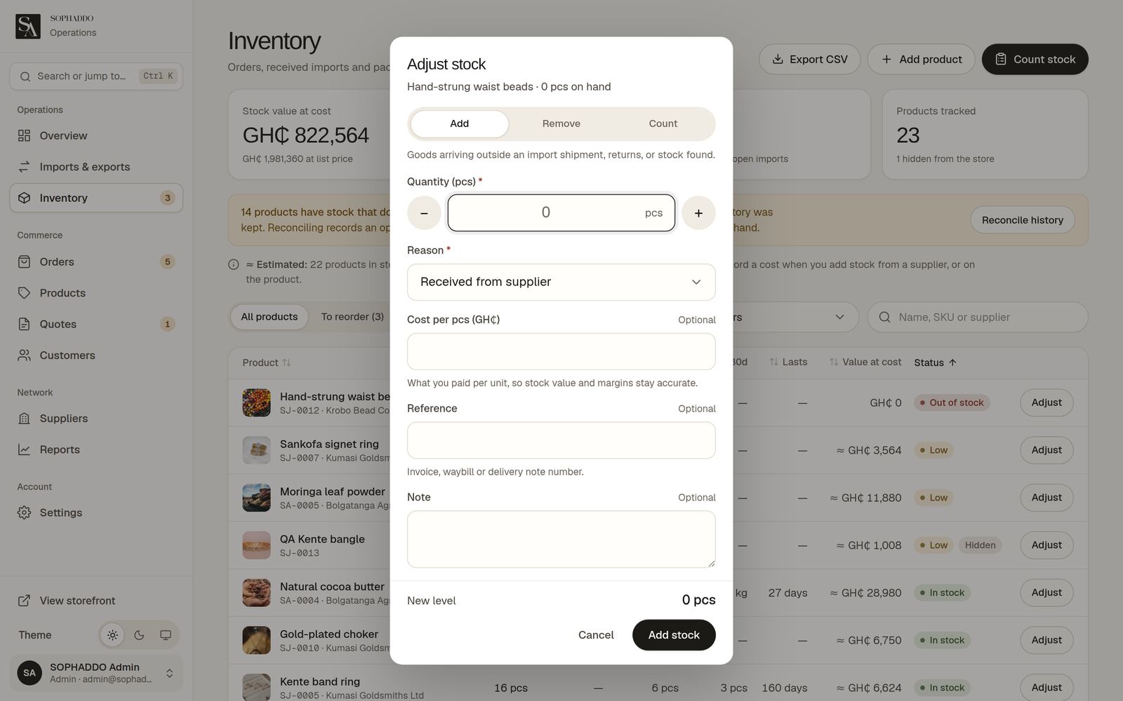
- Admin: opens on a ranked "Needs attention" queue, with orders, quotes, a stock ledger and a stage tracker for every shipment.
KEY FEATURES
- Split-hero home for two stores
- Live bulk-tier pricing
- Three-step checkout, Mobile Money first
- Plain-language quote requests
- "Needs attention" admin queue
- Shipment tracker & stock ledger
DESIGN SYSTEM & ACCESSIBILITY
- One token-based component system shared by the storefront and the admin, in light and dark themes.
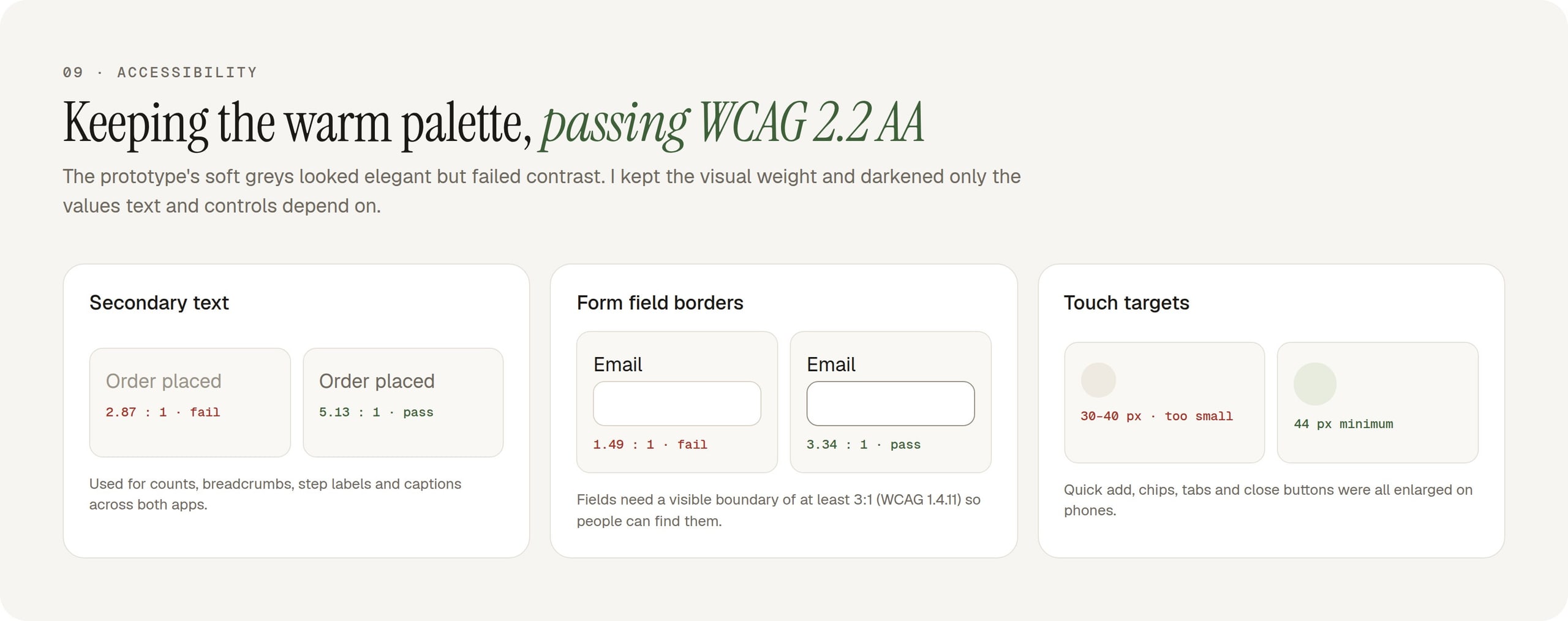
- Contrast re-tuned from 2.87:1 to WCAG 2.2 AA, and touch targets raised to 44px.
- Dialogs, drawers and tabs given proper roles and focus handling; axe reports 0 violations on the audited pages in both themes.
View gallery (13 images)Hide gallery
 (opens full size in a new tab)
 (opens full size in a new tab)
 (opens full size in a new tab)
 (opens full size in a new tab)
 (opens full size in a new tab)
 (opens full size in a new tab)
 (opens full size in a new tab)
 (opens full size in a new tab)
 (opens full size in a new tab)
 (opens full size in a new tab)
 (opens full size in a new tab)
 (opens full size in a new tab)
 (opens full size in a new tab)
BY THE NUMBERS
- From design to a shipped platform
- 1 month
- Phone calls needed to order, request a quote or track
- 0
- Stores, agro wholesale and jewelry, on one platform
- 2 in 1
OUTCOME
- Buyers order, request quotes and track deliveries without phoning the company.
- Staff enter phone and WhatsApp orders into the same system.
- The audit's high-severity themes (naming, units, freight and payment honesty, mobile errors, touch targets) were fixed first, most within 48 hours.
What I learned
Rolling a bolder visual round back the same day showed what the client valued: consistency between the two stores over novelty.