SIASTES – WEBSITE REDESIGN
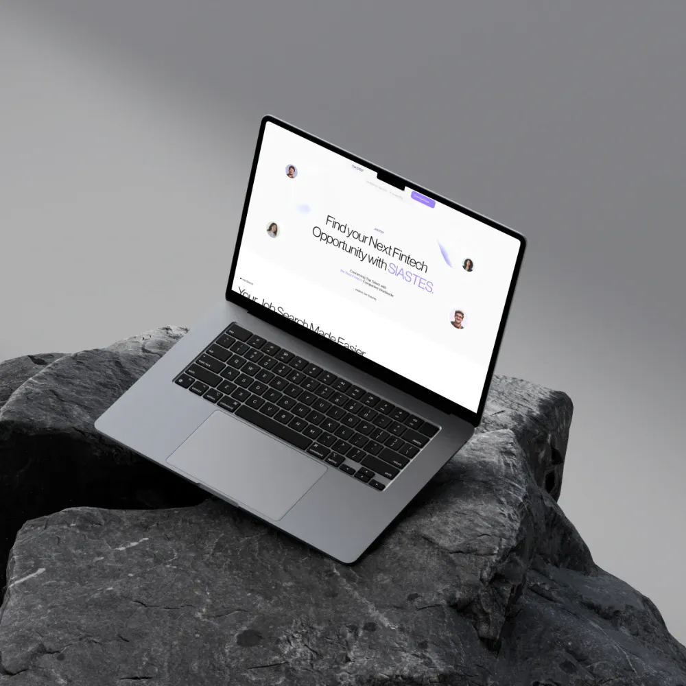
The web front door for a fintech jobs app: browse jobs and news, then download to post.
BACKGROUND & CONTEXT
- The old Siastes website was a single landing page. It pointed to the app, but there was nothing to use: no jobs, no news and no account settings.
- People on a laptop couldn't see open roles or keep up with crypto and finance news without installing the app first.
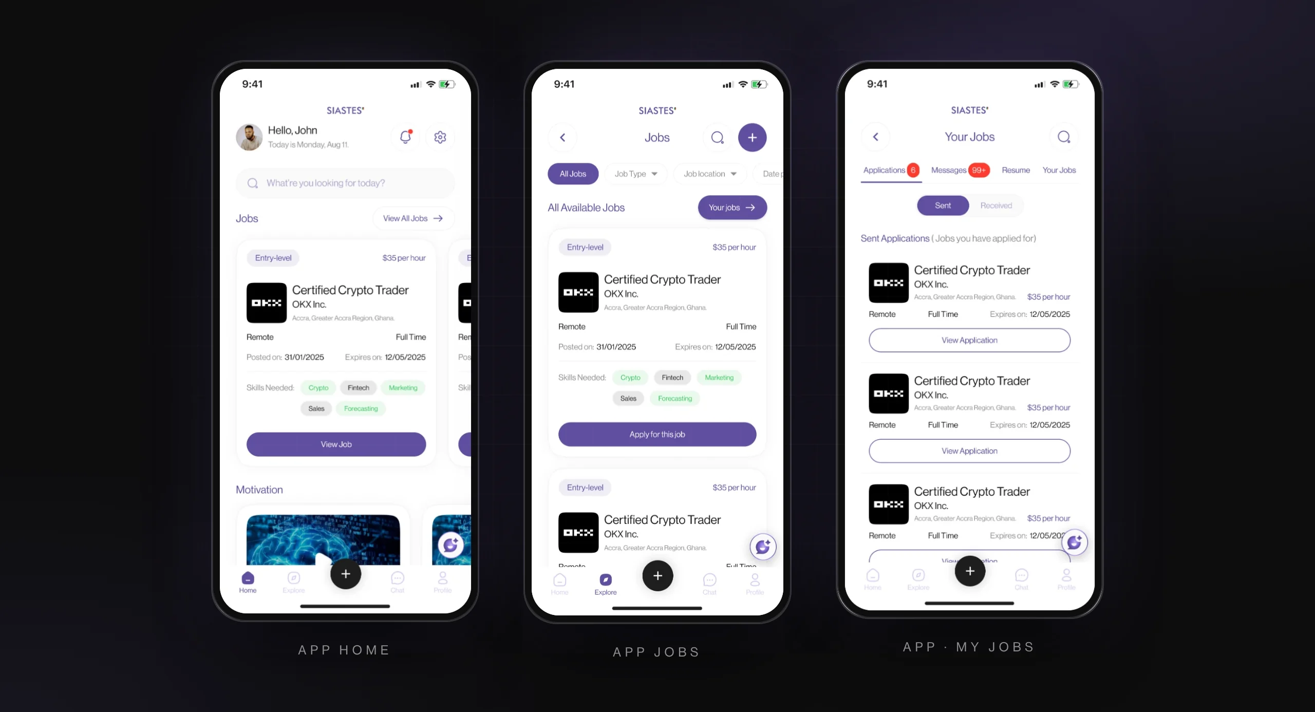
- The app's design system already existed, so the site had to feel like the same product on a bigger screen.
TARGET USERS
Job seekers on desktop: browsing roles and news, deciding whether the app is worth installing
Employers: checking credibility, deciding whether to list jobs (posting happens in the app)
Press and partners: looking for the story, the team and a contact
THE GOAL
Turn a one-page landing site into a website people can use: real jobs and crypto and finance news to browse, an account with settings, and a clear path to the app.
MY PROCESS
- Positioning
- Content structure
- Wireframes
- UI
- Framer build
KEY DECISIONS
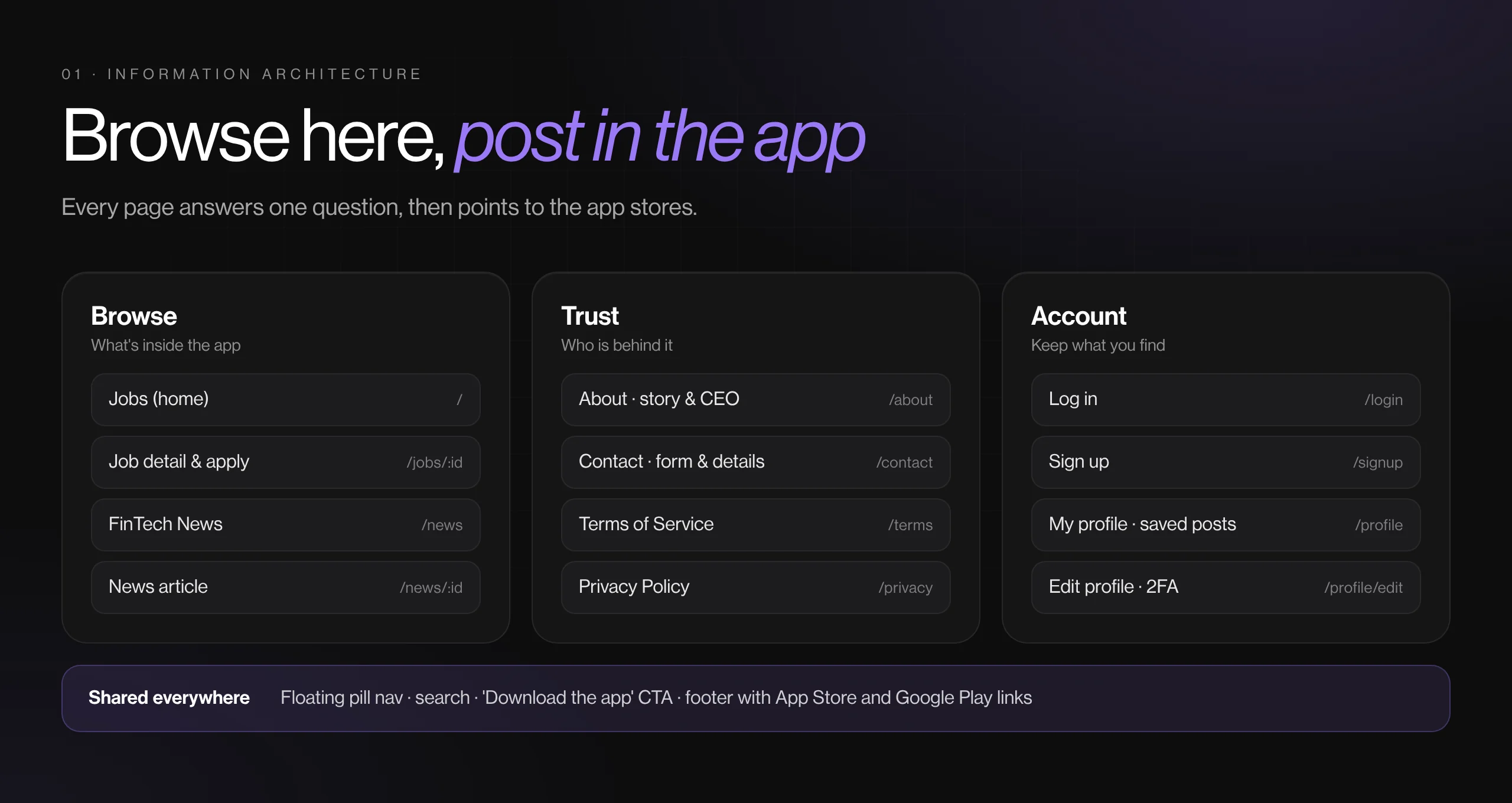
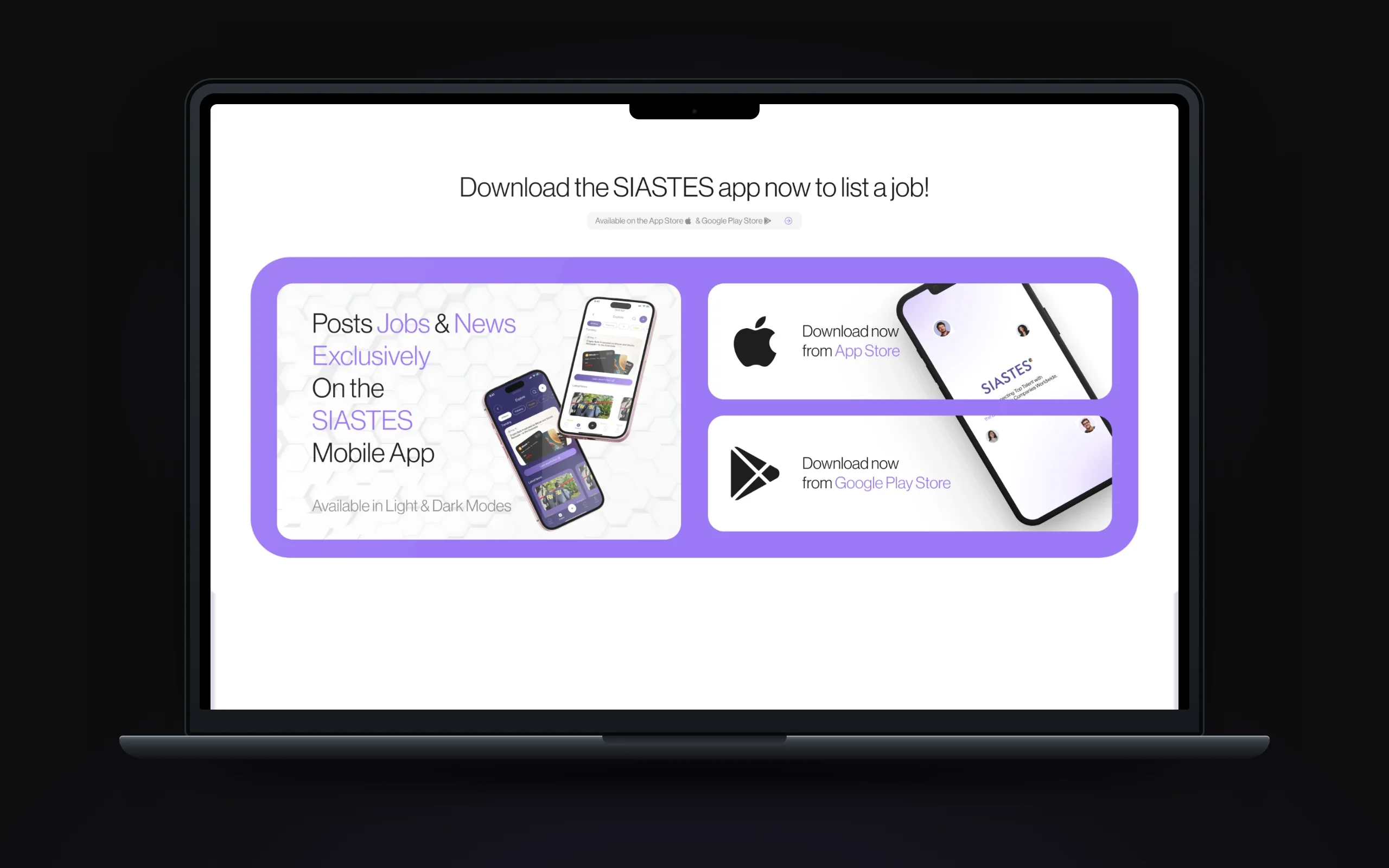
- Browse on the web, post in the app: every page ends in a download block
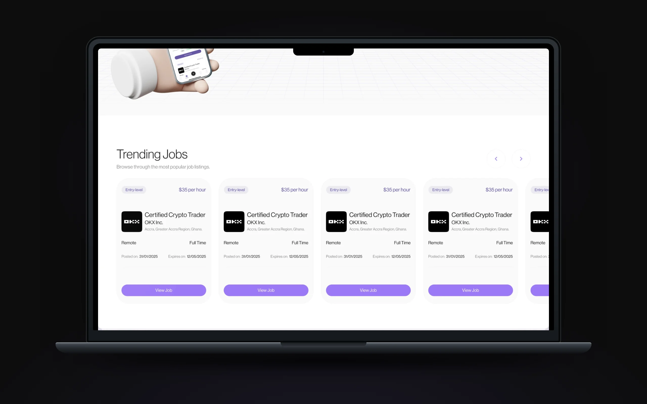
- Jobs first: the home page is the job board, with trending jobs and a filterable grid
- Same type, colour and cards as the app, so the web reads as the same product
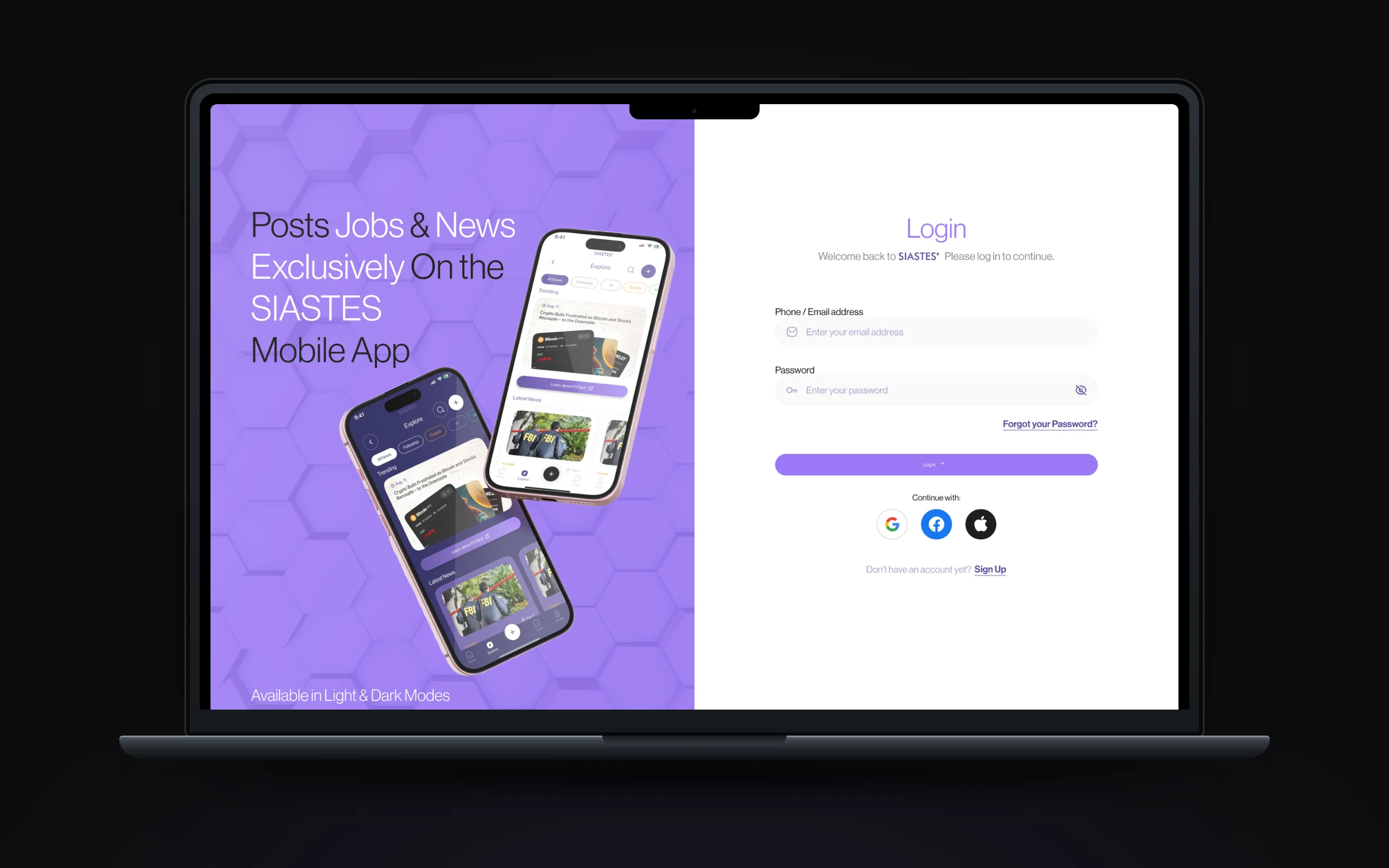
- A split log-in and sign-up page that promotes the app beside the form
- Employers get their own nudge: 'Are you an employer looking for workers instead?'
THE SOLUTION
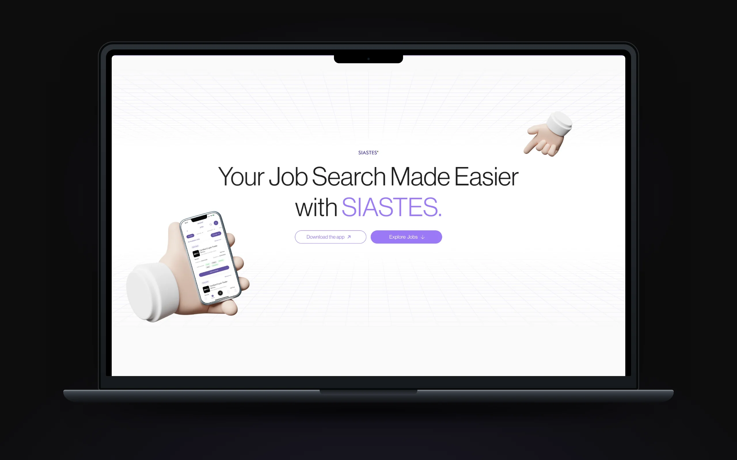
- Jobs home: a hero ('Your Job Search Made Easier with SIASTES.'), trending jobs carousel, filters and a three-column job grid.
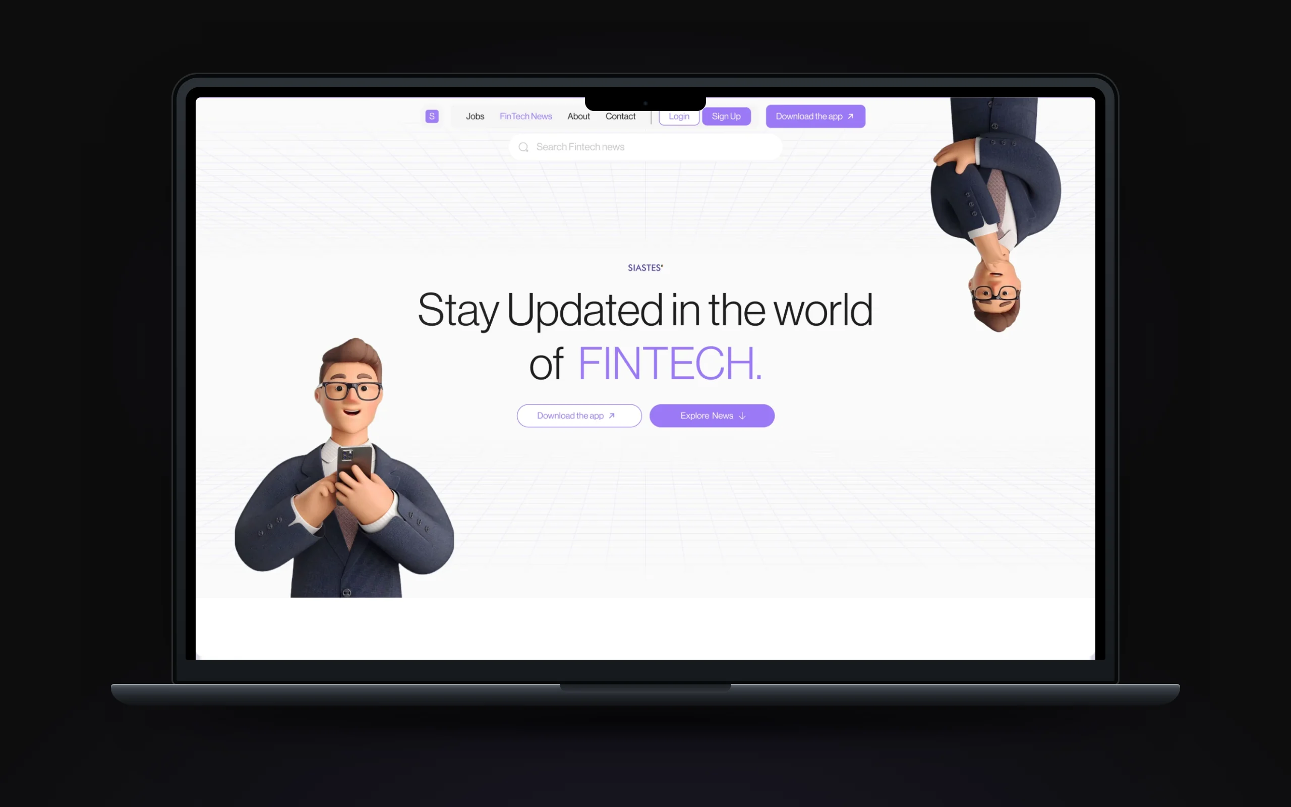
- FinTech News: trending and all news with category and date filters, plus a prompt to post from the app.
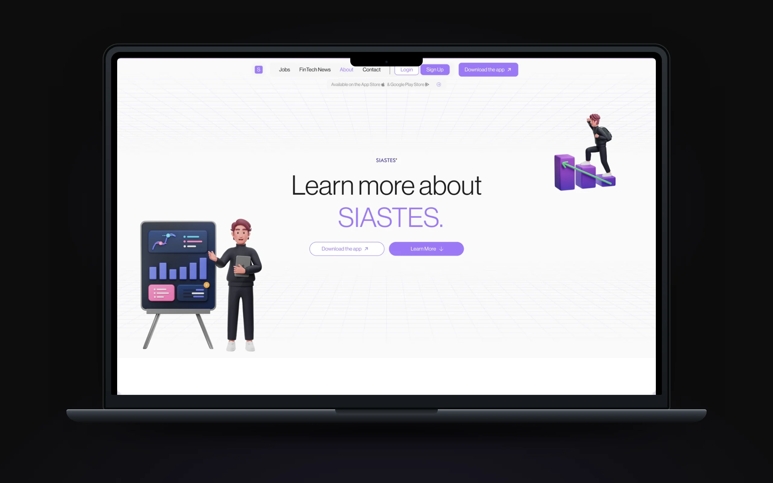
- Trust pages: About with the story and CEO, Contact with phone, email and a message form, and Terms and Privacy pages.
- Accounts: log in or sign up with Google, Facebook or Apple, a profile with saved posts, settings, and a three-step job application.
KEY FEATURES
- Job board home page
- Trending jobs carousel
- Job filters
- FinTech news hub
- App download funnel
- Apply with Siastes résumé
DESIGN SYSTEM & ACCESSIBILITY
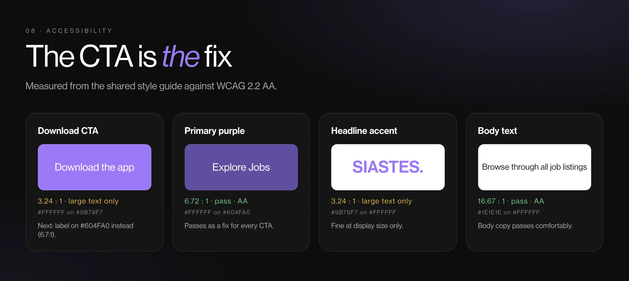
- Type, colour and card components inherited from the mobile app's style guide (Neue Haas Grotesk Display, purple #604FA0 and #9B79F7).
- A floating pill navigation and consistent section rhythm across all eleven pages.
- Next round: white on #9B79F7 is 3.3:1, so the most-used CTA needs the darker primary purple behind its label.
View gallery (9 images)Hide gallery
 (opens full size in a new tab)
 (opens full size in a new tab)
 (opens full size in a new tab)
 (opens full size in a new tab)
 (opens full size in a new tab)
 (opens full size in a new tab)
 (opens full size in a new tab)
 (opens full size in a new tab)
 (opens full size in a new tab)
BY THE NUMBERS
- App installs needed to browse jobs and news
- 0
- From one landing page to a working website
- 3 weeks
- Page leads to an app download
- Every
OUTCOME
- Siastes went from a one-page landing site to a website people can use: jobs to browse, crypto and finance news to follow, and an account with settings.
- The site matches the app, with a clear path from browsing to downloading.
- Employers had a direct invitation to list jobs, rather than being treated as job seekers.
- Legal, contact and team pages gave partners what they needed to take the product seriously.
What I learned
A website for an app earns attention by showing what's inside the app, not by describing it.