YENKO ADMIN DASHBOARD
One command centre for a last-mile delivery operation.
BACKGROUND & CONTEXT
Logistics teams juggled riders, customers, payments and compliance across disconnected tools — no single view of live deliveries, slow rider verification, slow support response.
TARGET USERS
Operations managers, support agents and compliance staff
THE GOAL
Give operations one screen to monitor deliveries, verify riders, handle payments and resolve issues.
MY PROCESS
- Ops workflow mapping
- IA
- wireframes
- UI
- prototype
KEY DECISIONS
- Key metrics on landing, detail one click away
- One repeatable table + detail-view pattern across every module
- KYC review designed as a queue, not a form
THE SOLUTION
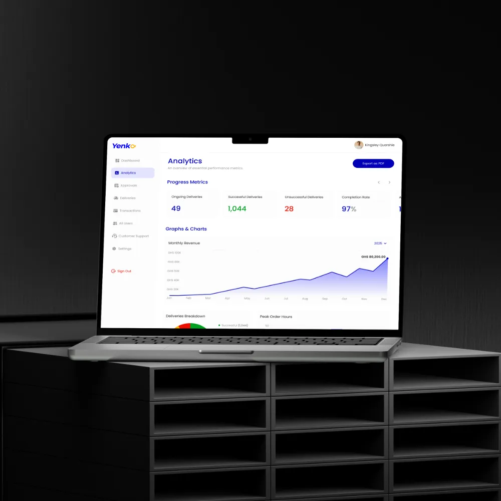
A unified dashboard covering live delivery monitoring, rider management, KYC approvals, GHS transactions, analytics and in-app customer support, held together by persistent sidebar navigation.
KEY FEATURES
- Live delivery tracking
- Rider & KYC management
- Transactions in GHS
- Analytics overview
- In-app customer support
DESIGN SYSTEM & ACCESSIBILITY
Table, filter and detail-panel patterns reused across all six modules under one sidebar model. Sortable headers stay visible and every column keeps a persistent label, so dense data stays readable without hover.
OUTCOME
A data-heavy interface that keeps six operational domains legible in one place.
BY THE NUMBERS
6 operational domains unified into 20 screens
What I learned
In data-dense tools, one pattern repeated beats six clever ones.